Google and Amazon are now in the oil business
Google, Microsoft, and Amazon are teaming up with Big Oil to squeeze more oil and gas out of the ground using machine learning technology
Source: Vox (Youtube)
Cumulative CO2 emissions calculator
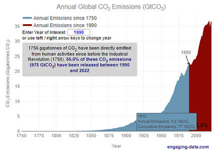
This shows the annual emissions of CO2 since 1750, before the industrial revolution. Due to rapid growth in population and energy use per capita over time, we’re emitting more CO2 each year: humans have emitted as much in last 28 years than the 240 years prior.
Source: Engaging-data.com
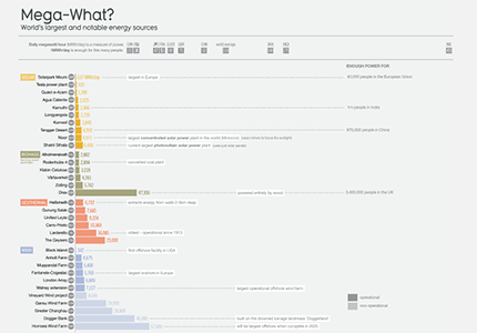
Megawhat?

Solar (Sun) Intensity By Location and Time
This visualization shows the amount of direct solar insolation (W/m2) all across the globe as a function of time of day and day of year.
Source: Engaging-data.com
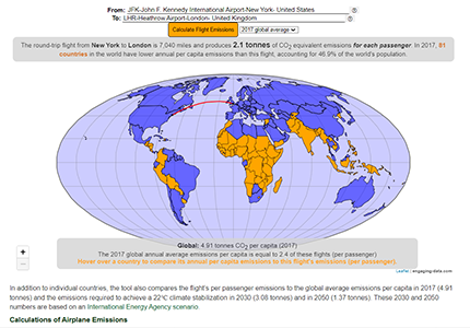
Greenhouse gas emissions from airplane flights
The following flight calculator and data visualization shows the miles and emissions produced per passenger by a airplane trip that you can specify.
Source: Engaging-data.com
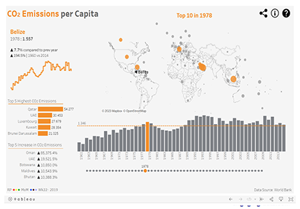
CO2 Emissions per Capita
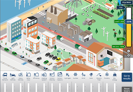
How America can leave fossil fuels behind, in one chart
A Skeptical Look at Climate Science
Degrees of Uncertainty is an animated data-driven documentary about climate science, uncertainty, and knowing when to trust the experts
Source: Neil Halloran (Youtube)
My 2050
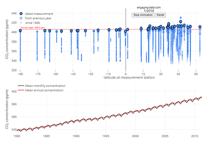
Visualizing The Growth of Atmospheric CO2 Concentration
This visualizes the growth in CO2 concentration in the atmosphere (mainly from emissions due to human activities, eg burning fossil fuels for energy production, deforestation + other industrial processes).
Source: Engaging-data.com
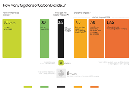
How Many Gigatons of Carbon Dioxide..?
have we released to date / can we safely release / are left to release?
Source: Informationisbeautiful.net
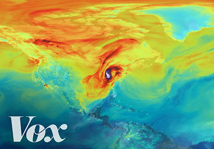
A visual tour of the world's CO2 emissions
A new high-resolution computer model created by NASA shows CO2, the greenhouse gas driving global warming, as you’ve never seen it before
Source: Vox (Youtube)
Analyse. Visualise. Decide.
Contact us for a demo of our applications or for more details how we can help with your clean energy or decarbonisation projects.